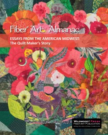
May 10, 2013

Turning vintage wool pants into an abstract art quilt


Meet Wendie Zekowski. Wendie’s hand dyed fabrics are her canvas for creative expression. She is inspired by abstract patterns that are representational of the natural world. She experiments with fabric through use of color, composition and embellishment. The composition of Wendie’s fiber art is understated and sophisticated, rich in color with embellishments as an accent; not the story. 

Dyeing natural fabrics such as wool, silk and cotton let Wendie choose her color palette so the first step in the process of materials selection begins by experimenting with dye. She uses any number of painting and resistance techniques to create abstract shapes of color on the fabric. Once the fabric is dyed, she evaluates the pieces for composition and then moves forward. Wendie says she works backward since she doesn’t start with an outcome in mind; but evaluates the opportunities put forth by the dyeing process. 


The story of the vintage pants. At one time this fabric was to become Candy’s pants. Yes, the progeny of a piece of fiber art is always interesting and this one has a unique tale. It was the 1950's in America when it was common for women to sew many of the outfits they wore; tailored clothing, not just aprons, handbags or carryalls. But lovely beautiful tailored pieces with big shoulders, narrow waists, pleats and big swing skirts. This fabric was was pinned and the cutting completed for a pair of women's trousers before life intervened and the project was put on hold. 

For sixty years. Boxes stored, boxes emptied; households sorted and then as destiny knows its own way, the fabric finally came to Wendie. The granddaughter of the owner of the fabric thought Wendie would know what to do with this vintage cloth. Over the course of ten to twelve weeks, Wendie dyed each of the pattern pieces a little differently creating a group of fabrics that complemented one another. She trimmed the pieces into strips and fitted them into an abstract composition. The finishing embellishment is hundreds of French knots. Candy's pants!
Thanks for stopping by,
Jenny

May 1, 2013

Ragga Eiriksdottir shapes contemporary Icelandic knitting

Between April and May, Minnesota Knitters rev up the engines and take spring by storm. Yes, this year there were quite a few snow storms in April but I think that made our knitting community even more motivated to find inspiration from all the fabulous knitting events within our community. This last weekend the Minnesota Knitters' Guild held their annual Yarnover. This is a one day event where well known (national) teachers come for a day and give over 650 students their best instruction, tips for techniques and know-how. The Yarnover also includes a market place that is part reunion, part wool grower and all fun.
As an encore, the Knitters' Guild asks one of the teachers to stay over and give a talk at the Guild meeting the following Tuesday. This year our speaker was Ragga Eiriksdottir from Iceland and she spoke at our Guild meeting last night.

All the way from Iceland!! Ragga was a fun, entertaining speaker and shared her love of knitting the Icelandic way. In fact, I would say that she has single-handedly put contemporary Icelandic knitting on the map. With her force of personality, fresh approach to pattern design and knitting techniques plus knitting tours and loads of national pride, it's easy to see how knitters are excited about getting knitty Iceland style. Icelandic Knitting
One of my all-time favorite knitting yarns is also a big export from Iceland. Lopi yarn comes from the Icelandic sheep which is a pure breed. The Icelandic sheep have two coats of wool. The undercoat is soft and downy and the outer layer is smooth and silky. It's this outer layer that helps to shed water and keep the sheep dry. I've always loved the slightly tough texture of Lopi--it's a stout wool made to be worn anytime of year which suits the Minnesotan in me just fine. I would rather wear a bulky warm sweater than a coat any day .
And the colors. Lopi takes dye very well offering subtlety as with the yarn I purchased last night and if you want to crank it up a bit, Lopi will do that, too. Here's a bag I knit from Lopi Lite. It's the Lucy bag pattern from several years ago. I felted the bag down a little just to tighten the stitches together but not to make them invisible. When I bought the yarn from my LYS, I bought strictly by color not really having a clue what it would become. I think that's the definition of a stash, right?

Anyway, thanks to Ragga for the fun talk last night and thanks to Shelley Hermanson for organizing the Yarnover for the umpteenth time. She's a dear.

Thanks and talk soon!
--Jenny

Apr 19, 2013

Abstract art quilt inspired by Hubble telescope


Fiber Artist Snapshot! A long time ago, in a galaxy far, far away...Susan Antell begins with her own hand dyed wool and then allows the shape of the colors dyed into the wool inspire the composition. Embellished with beads and embroidery, this piece is an abstract representation of the Orion Nebula. One of eight in her Hubble Space Series. Each piece is an abstract artistic representation of photographs taken by the Hubble telescope. Susan lives in Minnesota and currently teaches color theory and fabric dyeing classes at the Textile Center.

--Jenny

Apr 17, 2013

Art imitates life...a quilter's view of a forest fire

Nancy Birger told me about her husband’s work and how they have moved nine times over the years with assignments from the Fish and Wildlife Service to different parts of the United States. I asked how that influenced her quilting. She then showed me this amazing piece of art that depicts the Ham Lake Fire in the Boundary Waters in May, 2007. This is one piece in a series of three.


Overall, the quilt shows the progression of the fire and the severity of the burn as it raged though the BWCAW (Boundary Waters Canoe Area Wilderness) and into Canada's Quetico Provincial Park. Nancy used Tyvek (the house insulator) to visually describe the burn area. She burned the Tyvek then painted over the fabric using different colors of paint matching the severity of forest fire across the map.


Nancy used a photo transfer technique to add images of the forest fire into the quilt. In this photo, the flames that consume the trees look like they could leap off the surface. Combined with the visually crinkly and hard rough feel of the manipulated Tyvek, the quilt engages the viewer on more than one level. Direct cause and effect. The smoke alone must have been overpowering.


Meandering through the quilt is a red thread-painted line that gives us a point of reference on the map. That line is the Gunflint Trail.  The Gunflint Trail is a well known icon in BWCAW geography and history whose name conjures up a list of outdoor activities embedded in the Minnesota psyche. Outdoors enthusiasts go to that area for recreation but also for rejuvenation and inspiration, so the as the fire damaged the Superior National Forest, it changed a place that was beloved by many people.


The blue waters of the BWCA are depicted with hand-dyed blue cotton fabric. This choice of background provides a tranquil relief in stark contrast to the crunchy, scorched-looking burn area. The way the cotton was dyed gives the impression of summertime lakes and sky with blue depths and white billowy clouds. The quilt stitching is also in contrast to the inferno of the fire. Its horizontal lines are like pooling water with a slight ripple on the surface.

The fire started from a campsite left unattended at Ham Lake, Minnesota. Evacuations took place soon afterwards and twelve days later brave firefighters wrangled the fire under control after it burned 57 square miles of the Superior National Forest and parts of Quetico Provincial Park.

Nancy lives in Roseville, Minnesota and owns a long arm quilting business. Click here for more information: www.littlemotherquilting.com.

For more info about the fire click here: 2007 Ham Lake Fire


Thanks for visiting the Almanac,
Jenny

Mar 27, 2013

Renaissance reproduction on needlepoint canvas


What happened on the way to the museum?  Strolling along, taking in the ‘style et de charme’ of the Paris streets, Martha and her husband were on their way to the Louvre when out of the corner of her eye, Martha spotted a needlepoint shop. Full stop! Museum can wait! We’re going in! A delightful shop, located along the Seine between the Opera and the Louvre, winked and beckoned to its newest clientele. In its third generation of family ownership (granddaughter following in grandmother’s heels), the shop owners are known for their reproductions of Renaissance art on needlepoint canvas.
A (very) short bit about Still Life art
Still Life, the subject of this canvas, became very popular during the 15th and 16th centuries as cultural changes and ways of thinking about the natural world shifted European thought. As artistic subject matter moved from (mostly) religious icons and messages to detailed examination of the natural world, Optical Realism, with its high attention to detail, became very popular with Northern European artists. The advent of oil painting technique (which gained popularity in Europe in the 15th century) and its slow to dry characteristics, allowed artists opportunity to mimic the subtle color changes of a flower petal by layering and mixing colors together or to change the shape of the petal completely! Still, there remained a message or link through the subject matter itself. For example, still life paintings of food and flowers were thought to be symbolic of the seasons and of the five senses. Temporal, lasting for a brief period of time.


Meanwhile, back at the shop
Martha recalls the shop being filled with hand painted designs on canvas, books (in French) and an array of colorful thread in a variety of fiber. It didn't take long to find several pieces to her liking. But what is to come between a woman facing her needlepoint destiny and the little matter of the misplaced decimal in the course of financial negotiations between le Franc and the US Buck-a-roo? (Raised eyebrows). She figures it's all in the stranding. Observing the Parisian method of color 
selection and allotment, Martha began to calculate revisions to the amount she needs using her own estimations; which resulted in a slight price relaxation. Smiles and adieux all around, Martha and Clark set off for the Louvre.


Several months later the hand painted canvas arrived in the mail as promised. Delighted, Martha began working diligently on her new piece. Using a continental stitch on 14 point canvas it soon became apparent the supply of carefully selected yarn was dwindling at a faster rate than appearing as stitches on the canvas.  Could the Parisian method of determining thread quantity be the more accurate method after all?  Slightly panicked that the exact shade of midnight blue might not be available, Martha's on the horn to Paris, "it seems my initial assessments were inaccurate." Additional provisions arrived in due time bringing her the required stranding in the correct shade to complete the beautiful piece and hang it in her dining room. It is ‘belle et charmante’!


Thanks to Suzanne Shaff for taking the pictures at Martha's house in Colorado. It's always easy to do post production on good photography! And many thanks to Martha Ewald, my husband's wonderful aunt! She's the best!


Mar 23, 2013

Minnesota Quilters make quilts for Target House (again)!

Another year has gone by and it's Caring Quilts Day again! The good work continues! Today Caring Quilts celebrates 14 years of making quilts. Over 900 quilts have been donated to Target House at St. Jude's Children's Hospital in Memphis, TN. Here are some pictures of past days at Caring Quilts and here is Kim's story.

How Caring Quilts Came to Be 
by Kim Gannaway, Guest Blogger
Caring Quilts came to be because of a workshop I was taking back in 1999. The assignment was to create something that you were passionate about, and you couldn’t do it by yourself – you had to create a community to share in your passion.
So, after several starts and stops, I came up with a quilting project, which is something I’ve loved to do since college - so far, so good. And, I worked at Target Corporation, so I checked to see if I could donate them to Target House, which is a home-away-from-home for the families of kids who are receiving treatment for life-threatening illnesses at St. Jude Children’s Hospital in Memphis, TN. They said yes!
Taking a break at Shepherd of the Valley Lutheran Church
in Apple Valley, MN
Similar to a Ronald McDonald house, Target House is set up for longer-term care. Families from all over the world can stay for free of charge for as long as they need to – some are there a few weeks or months, some have stayed for a few years. You’ll hear all kinds of languages spoken there. There are 98 apartments with several common areas for the families to interact.
A quilter's hands
I’ve had the privilege of visiting Target House 3 times while I worked at Target, and it is indeed a very special place. At first, I expected a very depressing place, but it was the opposite. The support, love and care that the staff and the families give each other is very tangible. Sure, there are very sick children with no hair because of their chemo treatments, or scars from surgery, but there is also incredible support there, which is just as important a factor as the medical treatment. The staff and families all speak the same ‘medical’ language and can truly understand what each other is going through. Handing out quilts to the kids is truly one of the highlights of my life.
Some of the original quilt group from Shepherd of the Valley
So, back to the Caring Quilts project – I needed to involve a community. Not so easy – that means asking people for help, which is not easy for me to do. Can’t I just do it myself?  Definitely getting out of my comfort zone, I asked various companies for donations of fabric, batting and thread, as well as asking my local quilt group if they’d be willing to help make the quilts. They all said yes! We were a small group, though, so I decided to have a special day where lots of people could come and quilt, even those who didn’t know anything about quilting could help with tying knots and making labels. So friends and family and friends of friends came, and we made about 50 quilts that first year, which was one for every child staying at Target House. We even had a young girl scout troop come and help draw the personalized labels – everyone was so enthusiastic! This became a tradition for us too. I was so humbled by everyone’s generosity and willingness to give of their time and talents. 
Wrapped up in love!
So, Caring Quilts started the first year that Target House opened back in 1999 and has continued into 2011, even through an expansion where Target House doubled their number of apartments. We will be delivering about 120 quilts to Target House this year, thanks to the continued generosity of about 45 volunteers. And I still am humbled by the enthusiasm of so many – that sense of community is truly a powerful thing.  

Editor's Note: To date, Caring Quilts has delivered over 900 quilts to kids staying at Target House. kids.

Mar 13, 2013

Art elements and principles of design in beaded quilts


In the 2013 Almanac book I identified twelve artistic references; one for each month. I call them references because I used a combination of the elements of art and the principles of design. The designated artistic element or artistic principle allows the reader to view the featured pieces through the filter of that particular reference. During the month of March, the reference is focal point or emphasis. When I think about focal point, the place to which the artist wants to draw our attention, I think where it fits into the much bigger picture of composition. Click on the pictures to see the whole image.
The piece is trimmed in seed beads and follows the scalloped edges of rick rack.
It weighs a lot, too!
Before we get too far, let’s take a look at the Elements of Art and Principles of Design. The elements are the building blocks. They are line, shape, form, color, light & value, texture and space. We are familiar with the terms at some level; but I’ve included a couple of Learning Links (also in the right hand column next to his post).

The principles of art are the methods the artist uses to convey their message through their work. It's the ways in which they are combined that determine the effectiveness of the composition.  It is both the seed of inspiration and the framework around which the artist builds their creative process.

Two questions; first, what does the artist want us to look at? And, how do they get us to do that?
Repetition of the kaleidoscope pattern gives the quilt lots of action!
Looking at Nancy’s beaded quilt, what are the predominant elements used in this piece? Nancy, who is drawn to circles and derivatives of circles such as spirals, labyrinths, and kaleidoscopes, creates movement with the repetitive spacing of rounds shapes. The different types of forms, both straight and rounded, create symmetrical shapes and areas of calm within the quilt even though the overall arrangement is asymmetrical and has lots of excitement through color.

The piece is visually balanced so while there is a lot to take in, each circle plays its part and doesn’t overwhelm the whole.
Shapes and texture add depth and surround the focus point of each kaleidoscope.
The beads and ribbon create depth and bring the viewer in for a close examination of the many shapes, colors and ribbon textures featured in each kaleidoscope. Wound up ribbon is quilted into place at the center of each kaleidoscope making a bed for a large fancy bead which anchors it into place. It is multi-layered from the quilted base to the show-off beads on the top.


Learning Links:
Judith Willemsma Elements and Principles of Design http://www.youtube.com/watch?v=DWEhwp5JgZk (long one) 
The Elements and Principles of Art http://www.youtube.com/watch?v=2JWNXYLUIN8 (short one)

I love learning how composition comes together!

Mar 5, 2013

Hand made books and journals


I looked forward to a trip up north this past weekend. For me, each trip north is a mini-quest spent in anticipation of slipping through the pine belt into the north woods. This is where Mother Nature’s approach to landscape composition jumps to the big canvas.  Even though the vistas are longer range, their depth pulls me into a small framed view.  The woods transform within their cycle of life. Old lakes become marsh which gives birth to seedlings that put down roots and attract fowl and animals who adapt the environment to their needs. Each subtraction and addition makes for change.

The lakes area in central Minnesota is picturesque any time of the year, so when I get to see a  combination of my favorite things like snow, bare tree branches, and crisp white birch trunks against a blue sky, I’m fully living in the present. I’ve travelled the road so many times in all seasons that I notice growth, filling in, water depth and in some cases the current state of disrepair of the man-made structures. In nature, decay is expected and necessary. With our constructed things, keeping the place up improves everyone’s mood. So said.

From our place in the cities to our place at the lake, we cross thirteen rivers and creeks. One summer we made the list. The first is the Crow River (bordering Hennepin and Wright counties) and the last is the Pine River at the dam in Crosslake. We cross the Mississippi twice. The big version on the south side of Elk River and the much smaller, looping through the woods version in Crow Wing county.
Mississippi River
On my trip Sunday, I took a spur down a local road heading east. Three miles til the turn-off and down Partridge Ave and the gallery will be “on your left.” With some of the travel mystery removed, my GPS unerringly guided me to my destination and to my hard cover book making class.
Nice and flat, the stitches are at a good tension. We used a chain stitch. The dimensions are 4.5 X 6 inches.
The Ripple River Gallery, co-owned by Amy Sharpe and Bob Carls, sits snuggled into a small knoll across the road from a lake. The gallery is inside a renovated (former) garage and opened in 2000 so they could cut back on the miles traveled between art fairs and home. Amy is both a ‘weaver of words and fiber’ and Bob, who is a full time studio artist, creates wood turned vessels. Bob has participated in many juried exhibits, received corporate placements and sells his work worldwide.  
The Gallery shop features a wide selection of regional artists’ work including oil, pastels, book and paper arts, fiber, jewelry, pottery, wearables, baskets and much more. Inside, the gallery is filled with natural light and sits across a brick paved courtyard from their home. Amy says Bob is the master gardener in residence. The classroom is spacious, well lit and inviting.

Arrival
When I arrived my four classmates were already there. For those who know me, I always run a little late, so I make a practice of a friendly, but low key greeting. Shedding my coat, I slipped into the empty chair. The class was titled, “Hard Cover Journal and Journaling Workshop.” We had two workshop leaders. Elizabeth Carls who specializes in book and paper arts guided us through crafting a small hard cover journal and Amy Sharpe shared a wide assortment of journaling styles gleaned from her own experience. The workshop began at 11 a.m. and ran until 4 p.m. We took two stretch breaks and between the five students and instructors we ‘hoovered’ an entire batch of homemade oatmeal raisin cookies. Yes, the plate was filled twice!
Each group of pages is called a signature. Each signature has 4 pieces of paper. The paper used is Crane Letra at 130g. 
Hard Cover Book Workshop
Elizabeth had prepared materials for each of us, just what we needed, so there wasn’t time sidelined (with ‘choices’ because the instructor didn’t finish the prep work ahead of the class). When I arrived I noticed a digital clock among her things at her end of the table. As a student I was completely unaware of the time. I checked my watch once when we stitched the binding and was grateful that we’d been guided so skillfully allowing us to focus on learning each technique.  And, I was happy we would have plenty of time to talk journaling, because after all, as a fledgling writer, I am most curious how and where other writers develop their voice.

We started at the beginning with the words that describe the parts of a book. Elizabeth gave us a couple of hand-outs that included a glossary, notes about important characteristics of paper and grain as well as other key book arts topics. Determining grain in the paper is the critical step in making a well made book. All of the parts of the book should go in the same direction so it lays flat and the folded edges aren’t flaky and raw.  The board cover, inside cover paper and book block (actual pages of the book) all must flow in the same direction. If you take a sheet of paper and begin to fold it first lengthwise then bend it width-wise, you will feel more resistance in one of the directions. Take the easy way out on this! Go with the grain!

We began with a stack of pre-cut paper and divided the stack into six groups of four papers each. These groups of papers are called signatures and together they make up the book block. After they were folded, we stacked them alternating folded edge and open edge then put books and heavy objects on top of them. This process of compression ideally takes about 24 hours, but we let them flatten while we constructed the book covers.

Elizabeth discussed adhesives and application methods while we painted the goo onto our book boards; getting them ready for the decorative cover paper. Once the cover papers were selected and bubbles smoothed using a bone fold, we got to work on the mitered edges.
Lovely crisp mitered corner! Not bad for a first time!
O, for the clean mitered edge! As a knitter, using yarn as my medium, edges will never look as crisp as with paper, but once blocked a clean square edge on the collars, button bands and sides of a scarf makes them look well made. So I was especially interested in this technique. First take a straight edge and cut out the corners. Then use a piece of board block the same depth as the cover of the book and position it on its edge at the tip of the corner on a slight outward angle. Trim the triangles off the cover paper corners that stick out beyond the miter tool. This outward angle of the miter tool allows for the tip of the corner to be covered. Brush adhesive on the paper edge and wrap over the edge of the book board taking care not to use the bone fold with such pressure that the cover paper might rip. Gently fold the triangulated edges over the corners. Voila! Then add the inside cover page and you have one smart looking cover!
We used an awl to poke holes through the board covers and signatures. The outside cover paper is Chimyoga or Katazone. Both use a Japanese printing technique.
Our next tool we made was a jig. This was made from cereal box cardboard and its function is to provide consistent measurement of the distance between the holes we punched through the covers and signatures. We retrieved the signatures from underneath their books. Opened gently; we used an awl to punch a tiny hole through all of the pages. Elizabeth noted in her conversation, “keep the signature pages together otherwise you’ll never able to match up the holes again.” True.

Assembly was the final part of making our books. Stacking the back cover on the table and signatures with folded side toward us we got ready to stitch our book sandwich together. We used a circular needle (quilting needle) and waxed linen thread. Holding the front cover and first signature together requires patience as it feels cumbersome at first.  Most will agree stitching is an art in itself but once the process became familiar it went very smoothly. I made several mistakes by not making a chain stitch on one end of my book, but it stays together well.
Some of my journals stacked in my office. It's a sad, tacky collection. The ones that are completely filled are the the steno pad and the green spiral notebook on the bottom. Mostly thoughts about work!
Journaling
Amy is a writer, among many other roles.  She’s been a newspaper editor and for 18 years wrote a newsletter that went out to her community (both virtual and geographic). When she sat down at the table, she opened a box that contained a smorgasbord of book styles, topics and written word/pictorial combinations of which all are her journals. The wide assortment of types really opened my thoughts. I realized I thought of journaling as a linear process. Start with this book, fill it up, move on to the next. Nice and tidy, not a little here and a little there with unfinished edges and endings. Maybe I worry that I won’t be able to locate notes or thoughts. Or, I just like closure.  Amy had a small hand crafted book just for quotes she likes. Another ‘book’ contained handmade postcards, she sent back to herself while travelling. Some were down and dirty spiral bound ruled notebooks and one was leather bound embossed with the word, “Journal.”

Sometimes I don’t want to write.  Sometimes I want to hang on to objects they evoke enough memories without further explanation.  Lately, I have seen art journals and am enthralled with the layers of bold colors and tactile embellishments.  They contain such visual power!  But I still think they need words for context and balance.

Journals are a tool for remembering, pushing through parts of life or a simple documentation of what steps you took.  They can be hard to read when opened after many years, emotion rolling off the page. But mostly journals are caretakers of the parts of our lives we think most important to put into words, put on paper or create a specific piece of art for remembrance. I’m convinced each time we dig around in the section of our brain that contains memories, they change just a little. They have to; our current thinking is in a different context each time we review that past experience.  A journal keeps the content in its frame providing context and balance. A good way to remember your life!

For more info regarding upcoming classes and events Ripple River Gallery, click here: www.ripplerivergallery.com. For goings on in Elizabeth Carls’ life click here: www.elizabethcarls.com


Feb 28, 2013

Two color steeked cardigan with Kauni Effektgarn

If you like knitting with multiple colors, consider this two color stranding technique. Two strands, each in a different colorway are used throughout the piece. The color gradation comes from the way the yarn is dyed—each strand of yarn is dyed with multiple colors.
A modern color gradation with traditional Nordic symbols
In all, there are about 12 colors represented but with using only two strands of yarn. This makes the process of knitting simpler and also gives the knitter a bit of mystery as to how the colors are going to work together. The pattern shows traditional Nordic rune symbols but the long, gradual color changes give it a modern feel. 
Steeked cardigan with loops and pewter buttons
Knit by Michele Buck. Michele is from Minnesota, a prodigious knitter with many Minnesota State Farm blue ribbons to her name. This sweater took the blue in 2007. The yarn is Kauni Effektgarn from Denmark.


Feb 19, 2013

Lace yoke bulky cardigan sweater

Here's one from me: this is the year of knitting sweaters. At least that's my plan! I have some beautiful fiber just waiting for me to give it a purpose. My first finished object under the new plan. The pattern is top down with a lace motif across the yoke. And, oh joy! no seams. The fiber is Kraemer 60% NZ wool/40% US domestic single ply. 3.0 st/in on 10.75 needles. The clasps are easily found at Hancock Fabrics. I added velveteen ribbon up the button bands and around the neck for stability.
Actually this sweater almost didn’t happen. I put in some volunteer hours at The Shepherdess Naturals yarn shop in Anoka, MN last spring which gave me plenty of time to get acquainted with the stock. I saw it tucked in with the other wools sort of at the bottom of the cubes. The color is Bing Cherry; really dark burgundy with a little black mixed in. Plus, it’s a big thick single ply which reminded me of all those Icelandic sweaters to which I’m drawn. I kept watch until last summer when I noticed it was gone. Panicked, I asked Kathy if it sold and she said she was thinking about knitting something out of it, but if I wanted it I could buy it instead. I bought it all—in fact there is so much yardage, I could make two of this sweater.
It’s the age old knitters’ dilemma. Now that I have the yarn, where is the pattern? After a slow page-turn through my knitting books, and many hours cruising Ravelry, I finally found the right pattern for the job. The photograph is rather unassuming but showed me the pertinent details. It’s knit from the top down with a yoke, had a couple of options for neckline, cuffs, bottom and button bands but most of all, the pattern and yarn gauges matched.  I knew I had plenty of yarn.  It has that wonderful vintage Nordic feel about it.  Apres ski?
This is one thing I know about myself. While I love the idea of making up my own patterns, if I really want to put down some knitting, I need a pattern.  That’s not to say that I don’t make adjustments and changes along the way to improve what I’m working toward, but if the there are too many options, I don’t accomplish much.  I know I’m not alone in that.
I did rip it back a couple of times when I didn’t get the increases exactly matched in the front.  The pattern is accurate but I liked it better with two less increases in the front.  And I did knit one row in the lace yoke twice and while it looked okay, as it was symmetrical, it wasn’t supposed to be there, so it came out, too.
The clasps were found at Hancock Fabrics in Cedar Rapids, Iowa. I was with my step mom who is sort of a clothes horse and is very picky about trim.  The button bands and neck are trimmed with velveteen ribbing that’s the same shade of color as the yarn.  I’ve worn the sweater over a cashmere t neck and surprisingly enough the trim is fiber free.
Thanks for reading about my sweater.  Stay warm! Here are some links for reference: Shepherdess Naturals in Anoka, MN Shepherdess. The pattern can be found at: Grandma Jones Lacey Top Down Cardi on Ravelry